Indoor CO2 model
Editor’s note: I wrote this in January 2024, and completely forgot about it. Like genuinely, it was fun to reread. I’ve decided to chop off the end, and publish this now, and maybe I’ll write the ending to it later. We’ll see…
I’ve recently been looking at indoor CO2 level’s at Recurse Center’s physical space. There are lots of reasons to do so: airborne disease prevention, trying to limit CO2-linked cognitive decline, but also, and most importantly: curiosity.
This is what the dataset looks like as a whole:
co2_levels %>%
    # filter(date(time) == "2024-01-17") %>%
    ggplot(aes(x = time,
                y = co2)) +
    geom_hline(yintercept = 420, color = "darkgreen") +
    geom_hline(yintercept = 1000, color = "orange") +
    geom_hline(yintercept = 1500, color = "red") +
    geom_line() +
    geom_area(alpha = 0.2) +
    theme_ipsum_rc() +
    scale_y_comma() +
    scale_x_datetime(date_labels = "%b-%d", date_breaks = "1 day") +
    labs(x = NULL, y = "CO2 levels (ppm)", caption = "nibrivia.com",
            title = "Typical daily CO2 levels at Recurse Center")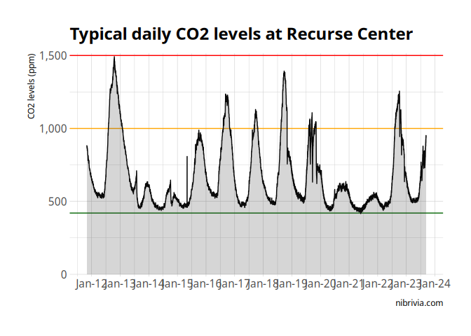
A few interesting things to note immediately:
- there’s a strong daily cycle,
- the days kinda look different from each other,
- the weekends have lower peaks,
- what’s going on on the 20th?
On the 20th, I happened
Right, so on the 20th, I was trying to keep us under 1,000ppm of CO2 in the space, so I kept opening the window.
This was in part because of a successful experiment done a long long time ago, in a land far far away… Half a day before, in the same space, I noticed the CO2 levels were high after “presentations”: a moment where everyone in the current batch gathers together to watch each other present. It’s really wholesome actually, they’re a highlight of every week.
As you might imagine, the CO2 levels were pretty high.
Can you figure out when presentations are from this graph?
co2_levels %>%
    filter(date(time) == "2024-01-18") %>%
    filter(time <= "2024-01-18 14:00") %>%
    filter(time >= "2024-01-18 2:00") %>%
    ggplot(aes(x = time,
                y = co2)) +
    geom_hline(yintercept = 420, color = "darkgreen") +
    geom_hline(yintercept = 1000, color = "orange") +
    # geom_hline(yintercept = 1500, color = "red") +
    # geom_vline(xintercept = ymd_hm("2024-01-18 16:00")) +
    # geom_vline(xintercept = ymd_hm("2024-01-18 17:00")) +
    geom_line() +
    geom_ribbon(aes(ymin = 420, ymax = co2), alpha = 0.2) +
    # geom_area(alpha = 0.2) +
    theme_ipsum_rc() +
    scale_y_comma() +
    scale_x_datetime(date_labels = "%l:00", date_breaks = "1 hour", date_minor_breaks = "1 hour") +
    labs(x = NULL, y = "CO2 levels (ppm)", caption = "nibrivia.com",
            title = "Presentations day")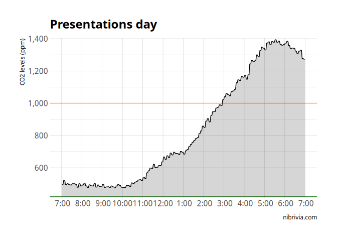
And like, I don’t know about you, but I would’ve looked at the peak, and said “5-6pm”. Which like, totally fair, the thing is, they happen before the peak.
It’s not like people stuck around or more people showed up after. (I mean, some did, but there were definitely the most people during presentations)
At some point, around 8pm, there were very few of us in the space, and I decided to setup a cross-breeze.
co2_levels %>%
    filter(date(time) == "2024-01-18") %>%
    filter(time <= "2024-01-18 17:00") %>%
    filter(time >= "2024-01-18 10:00") %>%
    ggplot(aes(x = time,
                y = co2)) +
    geom_hline(yintercept = 420, color = "darkgreen") +
    geom_hline(yintercept = 1000, color = "orange") +
    # geom_hline(yintercept = 1500, color = "red") +
    # geom_vline(xintercept = ymd_hm("2024-01-18 16:00")) +
    # geom_vline(xintercept = ymd_hm("2024-01-18 17:00")) +
    geom_line() +
    geom_ribbon(aes(ymin = 420, ymax = co2), alpha = 0.2) +
    theme_ipsum_rc() +
    scale_y_comma() +
    scale_x_datetime(date_labels = "%l:00", date_breaks = "1 hour", date_minor_breaks = "1 hour") +
    labs(x = NULL, y = "CO2 levels (ppm)", caption = "nibrivia.com",
            title = "Presentations day")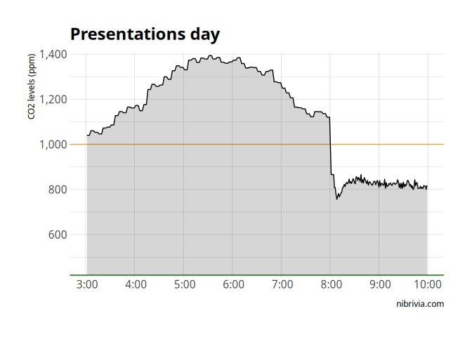
Boom!
In a few minutes, CO2 levels dropped by nearly 50%! (Outdoor levels are 420ppm, so going from 1,100 to 750 is 50% of the “added CO2”.)
And like, clearly, we just needed to flush the accumulated CO2 and we’re back to normal. This was incredibly validating: CO2 levels accumulate slowly over a day, occasionally just opening the windows will make things better. Right?
The next day
So fresh out of this really successful experiment, the next day, I open the windows the moment we get to 1,000ppm, knowing that we’ll stay down below “bad” levels of CO2.
co2_levels %>%
    filter(date(time) == "2024-01-19") %>%
    filter(time <= "2024-01-19 10:30") %>%
    filter(time >= "2024-01-19 4:00") %>%
    ggplot(aes(x = time,
                y = co2)) +
    geom_hline(yintercept = 420, color = "darkgreen") +
    geom_hline(yintercept = 1000, color = "orange") +
    # geom_hline(yintercept = 1500, color = "red") +
    # geom_vline(xintercept = ymd_hm("2024-01-18 16:00")) +
    # geom_vline(xintercept = ymd_hm("2024-01-18 17:00")) +
    geom_line() +
    geom_ribbon(aes(ymin = 420, ymax = co2), alpha = 0.2) +
    theme_ipsum_rc() +
    scale_y_comma() +
    scale_x_datetime(date_labels = "%l:00", date_breaks = "1 hour", date_minor_breaks = "1 hour") +
    labs(x = NULL, y = "CO2 levels (ppm)", caption = "nibrivia.com",
            title = "The next day")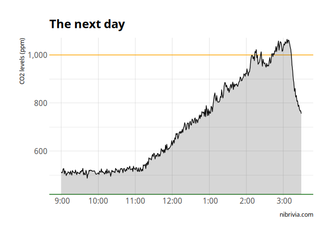
Nice!
co2_levels %>%
    filter(date(time) == "2024-01-19") %>%
    filter(time <= "2024-01-19 11:30") %>%
    filter(time >= "2024-01-19 4:00") %>%
    ggplot(aes(x = time,
                y = co2)) +
    geom_hline(yintercept = 420, color = "darkgreen") +
    geom_hline(yintercept = 1000, color = "orange") +
    # geom_hline(yintercept = 1500, color = "red") +
    # geom_vline(xintercept = ymd_hm("2024-01-18 16:00")) +
    # geom_vline(xintercept = ymd_hm("2024-01-18 17:00")) +
    geom_line() +
    geom_ribbon(aes(ymin = 420, ymax = co2), alpha = 0.2) +
    theme_ipsum_rc() +
    scale_y_comma() +
    scale_x_datetime(date_labels = "%l:00", date_breaks = "1 hour", date_minor_breaks = "1 hour") +
    labs(x = NULL, y = "CO2 levels (ppm)", caption = "nibrivia.com",
            title = "The next day... uh oh")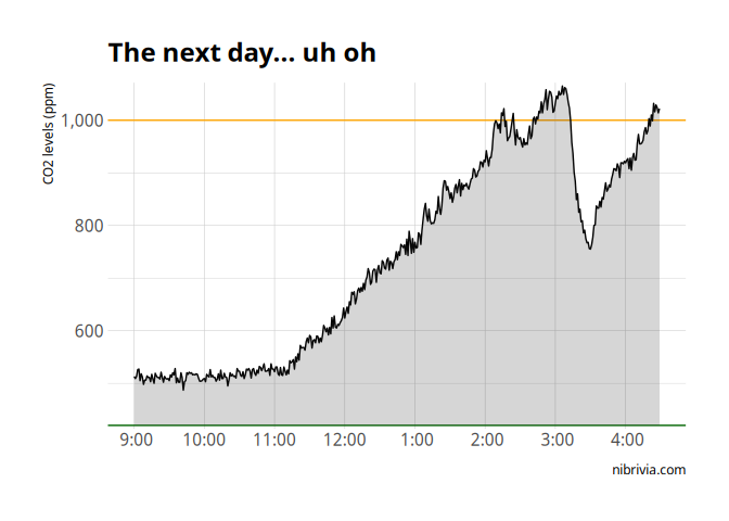
Huh, I expected that to stay down.
And you can see how the rest of the day went
co2_levels %>%
filter(date(time) == "2024-01-19") %>%
filter(time <= "2024-01-19 17:30") %>%
filter(time >= "2024-01-19 4:00") %>%
ggplot(aes(x = time,
y = co2)) +
geom_hline(yintercept = 420, color = "darkgreen") +
geom_hline(yintercept = 1000, color = "orange") +
# geom_hline(yintercept = 1500, color = "red") +
# geom_vline(xintercept = ymd_hm("2024-01-18 16:00")) +
# geom_vline(xintercept = ymd_hm("2024-01-18 17:00")) +
geom_line() +
geom_ribbon(aes(ymin = 420, ymax = co2), alpha = 0.2) +
theme_ipsum_rc() +
scale_y_comma() +
scale_x_datetime(date_labels = "%l:00", date_breaks = "1 hour", date_minor_breaks = "1 hour") +
labs(x = NULL, y = "CO2 levels (ppm)", caption = "nibrivia.com",
title = "The next day... the full story")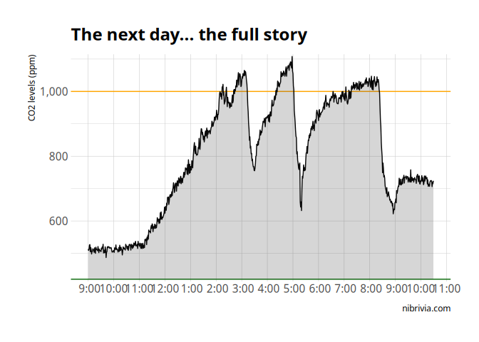 The second time, I left the window open for longer, which really brought
the CO2 levels back down quite far… just for them to bounce the moment
the windows were closed.
I didn’t try much for the rest of the day, until later that night, when opening the window did drop the levels.
At RC, the clue is in the name
So after this experience, I started saying “the number of people in the space controls the derivative of the CO2 levels”. And you can see why I thought that: multiple times, I opened the window, only for it to bounce right back up.
In general, it seems like opening the window during the day just serves to delay a, rather rapid, CO2 increase. In the evening, it accelerates an otherwise slow decrease.
I wanted to understand this better, so I decided to make a simple model of this.
Editor’s note: And this is where we’ll end things for now. Write to me if you can figure out what you think this model ended up being!